
Transcript
Hello everyone, welcome to Information Overload. I am Raymond Willey, and today we are going to be taking a dive six feet under into a topic that you may find to be a bit morbid, but that I hope you will also find interesting and informative. We are going to be looking at the leading causes of death in the United States.
The CDC’s National Center for Health Statistics publishes data annually that details the death counts for the leading causes of death by state and year since 1999. As you can imagine, this data can be very useful for public health firms that want to analyze trends in these rates over time so that they can effectively allocate resources and strategize.
With this in mind, the objective of this analysis will be to identify what the leading cause of death has been in the United States over the last 15 years, and see if we can predict which states should be treated as high risk for 2019. In order to get there, it was determined that we will really need to answer four primary questions:
First, we want to know, “What is the leading cause of death in the United States?”
Next, we will want to find out if the actual number of deaths per capita is trending up or down.
We need to identify the primary drivers of this rate.
And finally, we want to see if we can use this data collectively to identify high risk states.
So, the answer to the first question is quite self-explanatory. Here, we see a breakdown in the total number of deaths by cause since 1999, and we can clearly see that heart disease is responsible for 34% of the deaths among the top 10 leading causes, followed closely by cancer, which represents another 30%.

For the scope of this presentation, we will focus explicitly on heart disease as the leading cause.
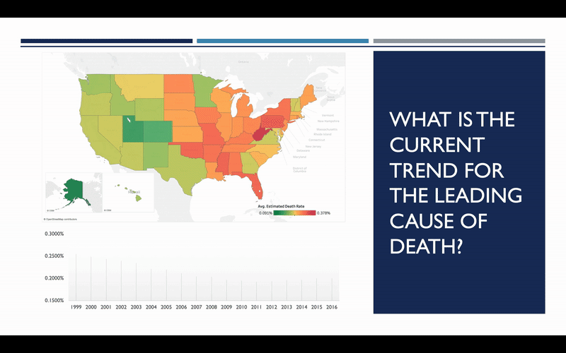
So, what does the trend look like? Has the rate of heart disease deaths increased or decreased since 1999? The map here shows you what these rates looked like in 1999, with red representing the highest rates, and green representing the lowest. We can see how this map changes over the course of the next 17 years, and it becomes quite apparent that there has been considerable improvement over that timeframe.
So that’s good news, but we still need to determine whether or not this trend will continue into the future. To do this, we need to explore some of the factors that influence heart disease the most. After doing some general research on the topic, it was decided to focus on three general areas:
Population Demographics such as age and gender
Rates of Alcohol Consumption
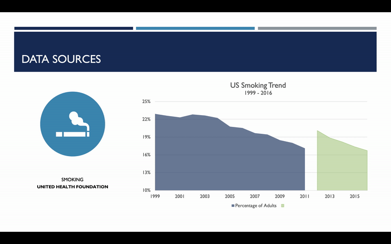
And Smoking Rates

One item I do want to bring your attention to with regard to smoking rates is that the methodology used to assess smoking rates changed in 2012. As a result, an artificial spike was observed. Because we are more concerned with the smoking rate trends than the absolute rate itself, it was decided that this subset of data needed to be adjusted. For each state, the annualized, geometric mean change in smoking rates was calculated from 2007 to 2011, and this was used to scale data for 2012 and beyond. And here you can see what that change looks like on a national basis.
With this data in place, it was then possible to measure how mortality rates are affected by changes in population demographics and behaviors. It is no surprise that age and smoking rates play a significant role, with the 70-79 age bracket having the greatest level of influence. However, less expected was the fact that males seem to be less susceptible heart disease deaths than women. This does not necessarily mean that men get heart disease less, just that they are less likely to die from it. According to the CDC, “Despite increases in awareness over the past decades, only about half (56%) of women recognize that heart disease is their number 1 killer.” So, consider this a public service announcement for those of you who were unaware.

The other thing that was surprising is that alcohol consumption did not seem to have much of an affect on death rates due to heart disease. In fact, the data suggests that increased wine consumption can actually decrease these rates. Now, a word of caution before you run out to buy your favorite bottle of red: increased wine consumption was also observed to be correlated with lower smoking rates. So, it is likely that it’s not necessarily the wine consumption, but the reduced smoking rates among wine drinkers that results in lower death rates to heart disease. You can see that the relationship here isn’t particularly strong either, though it was still found to be statistically significant.
In fact, these four factors alone were found to explain 83.4% of the variance in deaths to heart disease. This information should be strongly considered in determining not just where, but how resources should be deployed in the future. We’ll go over some ideas in this regard towards the end.
First, it doesn’t make a whole lot of sense to use data from one year to make predictions in the same year. If you were trying to make predictions for 2016 and you already have smoking rates for 2016, that would mean you can already tell the future and you don’t need me. So instead, 3- to 5-year time lags were used. In other words, data from 2011, 2012, and 2013 are used to make predictions for 2016. This should allow plenty of time for new data to come available, as well as enough lead time for actions to be planned around the results.

Second, high risk states are defined as those states where the number of deaths per capita is in the top 33% of all rates across the full range of data. Conversely, low risk states are those where the rates are in the bottom 33%. Additional domain expertise would be required to tune the target variable to reflect industry standards, though it shouldn’t take away from the validity of the models should they yield promising results.
So, how do we go about this? Well, 6 different model types were used to make predictions with 1,413 variants of those models. Each variant was tested on 5 cross-sections of the data to ensure no model achieved higher performance scores due to random chance. The top performing model of each type was then tested on a subset of data that none of the models had ever seen before. In the end, there one model was shown to clearly outperform the rest on all fronts: the Support Vector Machine.

As you can see here, the Support Vector Machine achieved a 90% accuracy rate with all cross-sections of test data, which is a great start. But, how does it do when we introduce new data the model has never seen? In this case, the model performed even better, achieving an accuracy rate of almost 92%.

It’s pretty clear that this is the model we want to use to make predictions for 2019, so let’s go ahead hand check out those results.
Here, we see a map of the US in 2016, with classification ratings based on the actual number of deaths recorded in the year. Green represents low-risk, yellow is medium-risk, and red is high-risk. Let’s zero in on the states that our model predicts will change by the end of 2019. As you can see, the results here are a bit mixed, though the overall downward trend seems to be continuing. And one state in particular stands out among the rest: Oklahoma.

Oklahoma was a high-risk state in 2016, so it was quite a surprise to see it predicted to be low risk so quickly. After closer inspection, it became apparent that the reason for this change is that the smoking rate dropped from 25.5% in 2010 to an all-time low around 19% in 2015.

It is not entirely clear how these results were achieved, though the state’s secretary of Health and Human Services, Terry Cline, has indicated that it can at least be partially attributed to smoking bans on state property, as well as commercial properties for those organizations that have opted to join the Certified Healthy Oklahoma program. It would definitely be worth taking a closer look at what they are doing to see if these results can be replicated elsewhere.
In the meantime, let’s zoom back out and have a look at 2019 predictions in the context of the full map. So, we have a total of 8 states that remained at high-risk, and we are adding Tennessee to that list since they’re projected to move from a medium to a high-risk rating.

So, having looked at these results, what can we do with this information? Well, I have a few recommendations that should hopefully give you some ideas.
The first should be rather self-evident, but reallocate some resources from Illinois and Oklahoma to states in higher risk categories. It would also be a good idea to begin moving some of those resources to Tennessee to see if the current trend can be curbed.
The next thing that can be done is to run smoking awareness ad campaigns. As showcased by Oklahoma, targeting this one factor alone can make a huge difference.
And finally, one other suggestion would be to run general awareness campaigns targeting women and retirees.

One other observation that wasn’t mentioned earlier is that women tend to represent higher percentages of the population in high population-density regions. Running awareness campaigns for women in urban areas and cities is likely to yield strong results with minimal investment. So, these are just a few ideas to give you a sense of direction.
With that in mind, I’d also like to give you an idea of some other directions we can go to further this analysis.
First, if the decision is to continue with this model and begin taking action, we can take a deeper dive into high risk states to figure out which factors contribute most to the risk-level on a state-by-state basis. This would allow for development of more targeted, regional strategies.
The other thing that can be done is to hold off on taking action, add more behavioral and socioeconomic features in the model, and see if accuracy can be improved. This should also give us some insight to better understand what’s going on in those central and mid-west states.
Finally, we could switch gears and perform a similar analysis on cancer. Given that heart disease seems to be continuing its downward trajectory (for the most part), it may be worth focusing on other causes of death that are potentially on the rise, and get ahead of them.

With that, I hope you found this presentation informative and interesting. And I hope it gives you some insight to how these types of analyses can be used to inform and influence strategic decisions within organizations. If you have any questions or comments, please leave them in the comments below, or feel free to contact me by email at raymond@overloadblog.info. Thanks for watching!
References
The Jupyter Notebook containing all relative data and analysis for this project can be found on Github.
In addition, a technical blog containing an overview of relevant code and a more detailed explanation of decisions made in this analysis will be provided in the near future.